Mood-Boosting Paint Color Ideas: Refresh Your Space This Spring
Give Your Home a Fresh Look with Mood-Boosting Paint Colors
Spring is the season of fresh starts. As the days get longer and the flowers begin to bloom, many people feel a renewed desire to revamp their routines, habits, and homes. It’s no coincidence that spring cleaning and home refresh projects surge during this time of year. There’s something about sunshine streaming through the windows and crisp morning air that inspires change.
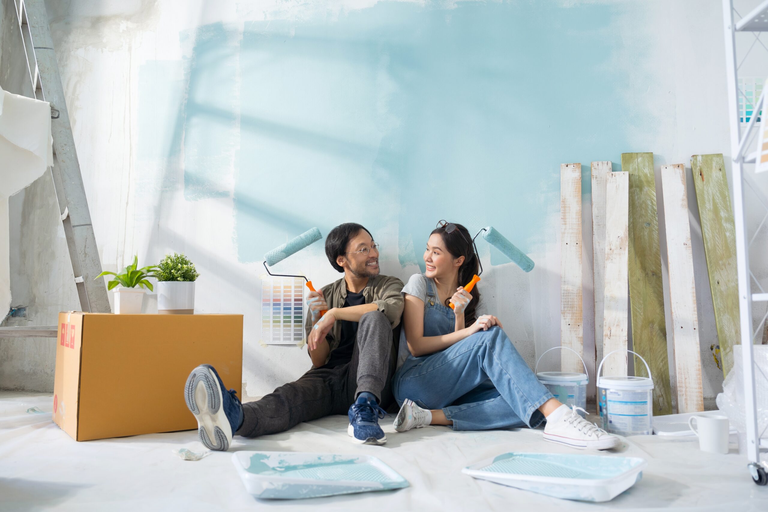
While major home renovations can be costly and time-consuming, there’s one home improvement project that’s relatively easy, budget-friendly, and transformative: a fresh coat of paint. Changing the colors in your home can breathe new life into your living spaces—and more importantly, it can significantly impact the way you feel.
Paint is more than decoration—it’s a tool that can set the tone for your home. Choosing the right color palette can boost your mood, reduce stress, and help you feel more energized, creative, or relaxed. As you plan your next seasonal refresh, consider how color can play a key role in creating a more intentional and uplifting living space.
The Psychology of Color: How Paint Influences Emotion
Color psychology is the study of how different hues affect human behavior and emotion. Marketers, designers, and architects often use this science to influence the atmosphere of a space. You can harness these same principles when selecting paint colors for your home. Different colors evoke different feelings.
Understanding the mood associated with each can help guide your design decisions:
- Yellow: Bright and sunny, yellow symbolizes joy and optimism. It’s a great color for energizing spaces where you start your day, like the kitchen or a breakfast nook.
- Blue: Often associated with calmness and clarity, blue has a soothing effect. It’s ideal for bedrooms, bathrooms, and any space where relaxation is a top priority.
- Green: This hue connects us to nature and promotes balance and tranquility. Use it in living rooms, offices, or anywhere you want to foster a sense of growth and harmony.
- Pink: Soft, nurturing, and comforting, pink tones create a peaceful atmosphere. It works well in bedrooms, nurseries, or areas where you want a gentle, welcoming vibe.
- Orange: Energizing and lively, orange is known to stimulate conversation and creativity. It can work well in playrooms, workout rooms, or home offices.
- Neutrals: Soft whites, warm beiges, and subtle grays are versatile and timeless. They help rooms feel open and clean while giving you the freedom to change accent colors as trends evolve.
Even within a single color family, subtle shifts in shade can create different feelings. A dusty rose feels sophisticated, while bubblegum pink feels fun and playful. A pale lemon yellow is airy and light, whereas a deep marigold brings warmth and depth. When you explore paint options, consider how the color will make you feel as well as how it will look.
Choosing Energizing Colors for Shared Spaces
Your shared spaces—like the living room, kitchen, dining room, and family room—are where people come together. These are the places where meals are shared, games are played, and guests are entertained. For these rooms, you want colors that encourage connection and infuse the space with positive energy.
Warm tones are often the go-to for these types of rooms. These include:
- Golden Yellows: Bright yet grounded, yellow evokes warmth and cheer. It reflects natural sunlight beautifully and helps make any space feel welcoming.
- Soft Corals: A more subtle take on orange or pink, coral adds vibrancy without being overwhelming. It’s ideal for feature walls or paired with white trim for a coastal-inspired look.
- Peach or Apricot: These creamy pastels bring a sense of warmth and softness. They’re perfect for cozying up dining areas or casual sitting rooms.
You can also try bolder hues for visual impact:
- Teal: A balanced mix of blue and green, teal brings both calmness and energy to a room. It’s a great option for accent walls or cabinetry.
- Mustard Yellow: Slightly more muted than bright yellow, mustard is stylish and sophisticated. Use it in living rooms with mid-century modern or vintage-style decor.
- Burnt Orange: Deep and rich, this color adds drama and depth. It pairs beautifully with leather furniture, natural wood, and textured fabrics like linen or wool.
Pairing warm colors with neutral elements—such as white baseboards, soft gray furniture, or wood accents—can help ground the space and prevent it from feeling overwhelming. Metallic details like gold or bronze fixtures can also elevate the room’s overall aesthetic.
Pro tip: If you’re worried about committing to a strong color, start with an accent wall. Choose one main wall in the room—perhaps behind a sofa or dining table—and paint it in your boldest choice while leaving the rest of the walls neutral. This creates a focal point without dominating the space.
Use Light to Your Advantage
When selecting energizing colors for shared spaces, it’s important to consider the lighting in each room. Natural sunlight can enhance warm tones, making them feel even more welcoming. If your space gets a lot of light, you can go slightly bolder with your paint colors without it feeling too intense.
For rooms with limited natural light, opt for lighter shades with warm undertones. For example, instead of a dark terracotta, try a soft peach or warm beige. You’ll still get the energizing benefits of warm colors, but the lighter shades will keep the room from feeling too enclosed.
Lighting fixtures also play a key role. Warm-toned bulbs can make any room feel cozier, while cooler-toned lighting might complement blues and greens more effectively. Test your paint colors in both natural and artificial light to see how they shift throughout the day.
Coordinate Paint with Your Decor Style
When you’re choosing mood-boosting colors, don’t forget to consider your existing furniture, artwork, and decor.
Your color palette should complement what you already have—not compete with it.
- For farmhouse or rustic styles, soft neutrals, sage green, and dusty blue work beautifully with natural wood and vintage accents.
- In modern or minimalist homes, crisp whites, bold color pops (like teal or mustard), and sleek grays enhance clean lines and simple furniture.
- If your home leans bohemian, don’t be afraid to mix rich jewel tones—like emerald, burnt orange, and plum—for a layered and eclectic feel.
Choosing paint that aligns with your interior style ensures your mood-boosting colors feel intentional and cohesive.
Create a Calming Escape with Soothing Paint Shades
While energizing colors work beautifully in shared areas, certain spaces in your home call for calm and tranquility. Think of your bedroom, bathroom, reading nook, or even a home office where stress reduction and focus are key. These areas benefit from a more subdued color palette designed to relax your mind and create an atmosphere of peace.
Some of the best calming colors include:
- Pale Blue: Reminiscent of the sky and sea, pale blue is one of the most soothing shades. It helps lower blood pressure and heart rate—making it a perfect choice for bedrooms or meditation rooms.
- Lavender or Lilac: These soft purples have a gentle presence that promotes rest and creativity. They’re ideal for nurseries, powder rooms, or cozy sitting areas.
- Sage Green: Earthy and muted, sage green is incredibly versatile. It feels grounded and serene and pairs well with natural wood and white trim.
- Warm Taupe or Creamy White: Not all calming colors need to be cool-toned. Warm neutrals create a sense of quiet luxury and offer a timeless backdrop that adapts to seasonal decor shifts.
To enhance the relaxation factor, pair these tones with cozy textures like cotton throws, linen curtains, or plush rugs. Incorporating indoor plants can also amplify the connection to nature and promote mindfulness in your space.
Spark Creativity with Playful and Vibrant Hues
Some spaces in your home should inspire action and imagination—especially those meant for creativity, hobbies, or fun. Whether you’re designing a child’s bedroom, a craft room, a home gym, or a playroom, color can play a huge role in stimulating energy and joy.
Try incorporating playful colors like:
- Bright Orange: Known to boost enthusiasm, orange is great for spaces where creativity flows. It works well on an accent wall or as a stripe in a geometric pattern.
- Sunshine Yellow: This high-energy hue helps spark optimism and is perfect for craft rooms, laundry rooms, or even inside closets for a cheerful surprise.
- Vibrant Pink: Not just for kids—vivid pinks bring a bold personality to any space and pair well with patterns or wallpapers.
- Sky Blue or Aqua: While soothing, these lighter shades can also feel refreshing and energizing in rooms where you need both focus and imagination.
You don’t need to go overboard. A touch of bright paint on a door frame, the inside of a bookshelf, or a half-painted wall can give a space personality without overwhelming the room.
Fun tip: Use chalkboard paint in a color like cobalt blue or raspberry. It’s not only visually engaging but also functional—giving your household or kids a spot to jot notes, draw pictures, or organize ideas.
Elevate Your Home with Sophisticated, Elegant Tones
Not every spring refresh needs to be bright and playful—there’s plenty of room for rich, moody, or refined colors too. These elegant tones are perfect for homeowners looking to create more depth, drama, or luxury in their home’s design.
Try these elevated paint ideas:
- Emerald Green: Deep and luxurious, this hue makes a bold statement in a dining room, office, or library. It pairs beautifully with gold or brass finishes.
- Sapphire Blue: Strong yet serene, this jewel tone works well in entryways or bathrooms and complements both traditional and modern decor.
- Deep Plum or Aubergine: A mature take on purple, these tones add richness and romance to bedrooms or hallways.
- Charcoal or Smoky Gray: These neutrals are dramatic yet timeless, especially when paired with white trim or light wood flooring.
Balance is key with these tones. Incorporate lighter elements—such as light-colored furniture, ample lighting, or mirrored surfaces—to avoid making the room feel heavy or dark. Layering textures like velvet, metal, or leather can further enhance the elegance.
Practical Tips for Picking the Perfect Paint Color
Feeling overwhelmed by paint swatches? You’re not alone. With so many shades to choose from, narrowing down your choices can feel like a major task.
Here are some helpful tips to guide your selection:
🖌️ Test Samples First
Paint a few swatches on each wall of your room and observe them throughout the day. Lighting can dramatically change how a color appears—what looks beige at noon might look peachy at sunset.
🖌️ Match the Mood to the Room’s Function
Think about how you use the room. Is it a space for focus or for socializing? Calm tones are better for bedrooms or offices, while bold colors shine in kitchens and dining areas.
🖌️ Check Your Current Decor
Your wall color should work in harmony with furniture, artwork, rugs, and other accessories. If your decor has strong color themes, pick a wall color that complements—not competes with—them.
🖌️ Use Color Visualizer Tools
Many paint brands offer online tools where you can upload a photo of your space and digitally preview how different colors will look.
🖌️ Start Small
Not sure about a bold color? Start with a powder room, a hallway, or an accent wall. These smaller spaces allow you to experiment without overwhelming your home.
🖌️ Don’t Forget the Finish
Glossy finishes reflect more light and are easier to clean—great for kitchens and bathrooms. Matte or eggshell finishes provide a softer look that’s ideal for bedrooms or living rooms.
Storage Success Starts with the Right Space
Refreshing your home with a new paint color is exciting—but it often requires clearing out furniture, decor, or seasonal items to make space for the project. That’s where self storage can help! Renting a self storage unit during your home update allows you to work more efficiently and keeps your belongings clean, organized, and protected.
By temporarily storing furniture or boxed-up decor, you’ll give yourself the space and flexibility to move through your painting project without the clutter and stress. Once your room is complete, you can bring items back in thoughtfully—or even choose to keep some in storage to maintain a fresh, minimal vibe.